


Responsive web design is a method of designing websites that ensures optimal viewing and interaction across devices: from desktop monitors to smartphones, tablets, smartwatches, and even modern refrigerators. By automatically adjusting layouts, images, and navigation elements, responsive design guarantees your website remains visually appealing, easy to navigate, and fully functional, regardless of the screen size or orientation used by visitors.

Why is Responsive Design Essential?
Responsive web design is like equipping your website with a sixth sense. It instantly recognizes the device accessing it and adjusts itself seamlessly, behaving like a contortionist. No more frustrating pinching, zooming, or rage-tapping—just sleek, smooth browsing experiences from your couch, commute, or coffee break.

Key Elements of Responsive Web Design
Flexible Layouts
Say goodbye to rigid pixel boxes. Responsive layouts utilize fluid grids based on percentages, allowing your content to stretch, shrink, and shapeshift effortlessly. Like slime, but smarter.
Adaptive Images
Have you ever seen an image burst awkwardly from its container? Not with responsive design. Adaptive images scale gracefully, maintaining sharpness and clarity. They’re retina-ready and drama-free, regardless of screen size.
CSS Media Queries
These clever CSS snippets dynamically tailor your site’s styles based on screen dimensions. Think of media queries as the versatile costume department in your website’s theater production: one performance, countless perfect outfits.
Mobile-First Mentality
Design begins with the smallest screens (hello, smartphones!) and progressively enhances for larger devices. This approach ensures your site remains lean, optimized, and lightning-fast for users on the move. Prioritize the essentials, eliminate clutter, and everybody wins.
Benefits of Responsive Web Design
Improved User Experience
Smooth scrolling, legible text, and effortlessly tappable buttons create a browsing experience that’s as soothing as a spa day for your visitors.
Enhanced SEO Performance
Google rewards mobile-friendly sites. Want improved rankings and more visibility? Go responsive: it’s a simple formula for success.
Easier Website Maintenance
One site to rule all screens. Ditch separate mobile and desktop versions, streamline your development, and watch your dev team celebrate with gratitude (and memes).
Inspiring Examples of Responsive Design
- HBR is a stellar example of responsive web design, particularly for content-rich websites. It proves that editorial sites can be just as elegant and performant on mobile as they are on desktop.
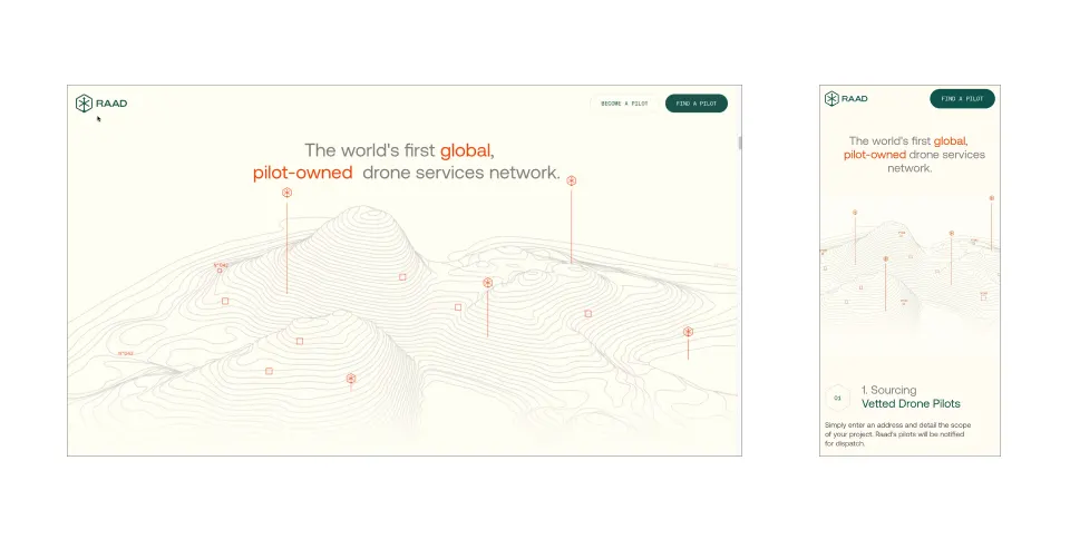
- RAAD exemplifies a mobile-first, responsive design that delivers a seamless user experience across devices. Its fluid layouts, responsive imagery, and clear CTAs ensure that users can easily navigate and interact with the site, whether on a desktop or mobile device.
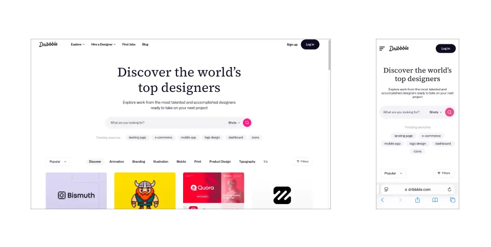
- Dribbble’s platform demonstrates the flexible grid principle, enhancing the browsing experience by adjusting content layout according to the viewing device. This responsive design ensures that users have a seamless experience whether on a desktop or mobile device.
Expert Tips for Responsive Websites
- Design for Accessibility: Ensure your site is welcoming and functional for everyone, including people with disabilities.
- Test, Test, and Test Again: Continuously verify responsiveness across multiple devices. Be thorough; your visitors will thank you.
Conclusion
Getting your site responsive is essential. Think fewer abandoned shopping carts, happier mobile shoppers, and customers actually sticking around because your site doesn’t make them lose their minds. Whether you’re selling products or showcasing your brand, responsive design turns casual browsers into loyal fans. Give your visitors a smooth, hassle-free experience on every device, and watch them keep coming back—no rage-tapping necessary.
