If you’ve ever sat in a design meeting where someone argued “let’s just make it pop,” consider this your friendly reminder: color is not decoration. It’s communication.
A recent Quanta Magazine article, “When Did Nature Burst Into Vivid Color?”, makes that point on an evolutionary scale. It turns out that eyes capable of seeing in color evolved before the flashy flowers, fruits, warning stripes, and show-off feathers. The hardware came first; the messages filled in later.
That’s exactly how good design works. You don’t pick colors for fun. You pick them because they carry meaning.

Evolution’s Color Playbook (and Ours)
Here are a few evolutionary lessons that map directly to branding and UX:
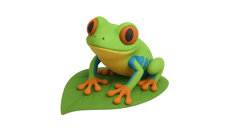
- Red = urgency. Poisonous frogs, ripe berries, arterial blood. The red color has screamed “pay attention!” for millions of years. That’s why it’s perfect for traffic lights, sale stickers, and notification badges.
- Green = safe, edible, go. Green plants meant food and shelter. Still today, green is the go-to for health apps, eco-brands, and anything tied to growth.
- Blue = trust and stability. Nature doesn’t throw blue around casually — oceans, skies, and not much else. That rarity makes it feel expansive, calm, and reliable. Banks and insurance companies bathe in it for a reason.
- Yellow = attention grabber. Bees, wasps, and toxic frogs — yellow combined with black is the universal hazard tape of nature. Brands use it to draw the eye instantly.
- Contrast = action. A peacock tail is impressive because it pops against a duller background. The same goes for a well-placed CTA button. Without contrast, you’re just camouflaging your product.
Why Brands Should Care
When you pick a palette, you’re not just painting. You’re writing a sentence in an ancient language. If your CTA button blends into your background, your message is lost. If your brand color contradicts your message (say, using calming blues for an energy drink), your communication is muddled.
Color works because our brains are wired for it — wired by millions of years of survival signals. Ignore that, and you’re not just making a weak design choice; you’re ignoring the operating system your audience runs on.
Design Takeaway
Every shade carries baggage. Every hue carries history. Good brands know this and use it. Great brands bend it carefully without breaking trust.
So the next time you reach for a swatch, ask yourself: what’s the message here? What survival instinct am I triggering?
Because color isn’t about making things pretty. It’s about making things clear. And clarity is the ultimate UX.


