Creating an exceptional user experience (UX) is like building a well-oiled machine—each element must fit together seamlessly. Whether you’re a startup founder, a designer, or just someone curious about how digital magic happens, understanding the five S’s of UX design is crucial. Let’s dive into these essential components and see how they work together to create seamless, enjoyable user experiences.
Strategy: The Master Plan of UX Design
Every great product starts with a solid strategy. This phase involves identifying your business goals and understanding your users’ needs. Think of it as laying the foundation for your digital masterpiece. By clearly defining what you want to achieve and what your users expect, you set the stage for a product that truly resonates with its audience.
Example: Imagine you’re launching a new fitness app. During the strategy phase, you’d research what fitness enthusiasts need from an app—like personalized workout plans and progress tracking—and align these insights with your business goal of becoming a top-rated fitness app.
Scope: Defining Features and Content in UX Design
Once your strategy is down, it’s time to define the scope. This means determining the specific features and content your product will include. It’s like drafting a value proposition that aligns perfectly with your business objectives and user needs.
Example: For our fitness app, the scope might include features like workout videos, a calorie tracker, and a community forum. Each feature is chosen because it adds value and aligns with both the business goals and user expectations.
Structure: Mapping the User Journey in UX Design
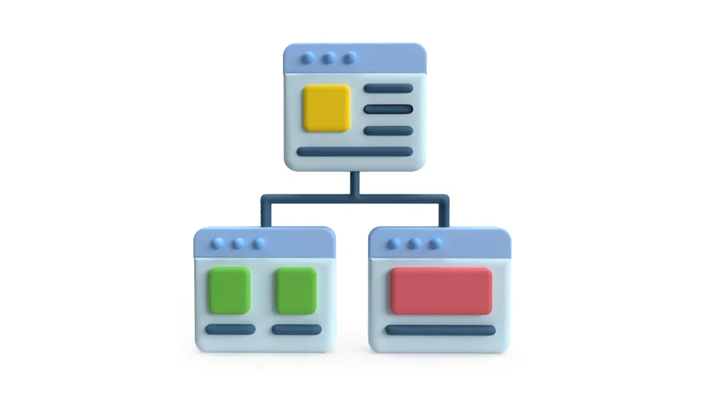
The structure phase involves creating the skeleton of your product. Here, you’ll design how users will interact with it and how information is organized. This includes creating site maps and flowcharts to visualize user journeys.
Example: You might design a flowchart that maps out how a user signs up for the fitness app, chooses a workout plan, and tracks their progress. This ensures that the app’s navigation is intuitive and user-friendly.
Skeleton: Blueprinting Your UX Design
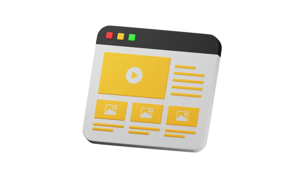
Now it’s time to bring your ideas to life with wireframes. These are early sketches that outline the structure of your digital product, from low to high fidelity. Wireframes help visualize how each part of the product will look and function.
Example: Creating wireframes for the fitness app might involve sketching out the layout for the home screen, the workout plan page, and the progress tracker. This helps stakeholders visualize the app before development begins.
Surface: Adding the Final Touches in UX Design
Finally, we add the visual elements that make your product pop. This includes colors, typography, and illustrations. Visual design isn’t just about aesthetics; it’s about enhancing usability and creating an emotional connection with users.
Example: For the fitness app, vibrant colors and motivational typography might be used to inspire users. Icons and illustrations guide users through the app, making it not only functional but also enjoyable to use.
Continuous Improvement: The Never-Ending Story
UX design doesn’t end with the final design. It’s an iterative process that involves continuous testing and improvement. Heuristic evaluations and usability testing help identify areas for enhancement, ensuring your product evolves to meet user needs.
Example: After launching the fitness app, you gather user feedback and conduct usability tests. Perhaps users find the progress tracker confusing, so you refine the design to make it more intuitive. This continuous improvement ensures the app remains user-friendly and effective.
Conclusion
Creating exceptional user experiences is a journey, not a destination. By understanding these five S’s of UX design, you can develop products that not only meet but exceed user expectations. So, whether you’re building a new app, redesigning a website, or simply curious about UX, remember that great design is all about understanding your users and meeting their needs.
Stay tuned to our blog for more insights and tips on UX design!


