Developing a Comprehensive Spiritual Website
Inner Light Ministries (ILM) needed a versatile website to support its mission of teaching spiritual awakening through meditation and self-study. The site features integrated multimedia Zoom meetings for online seminars and community events, guided meditation videos, audio clips, books, and workbooks.

Designed for Spiritual Seekers Worldwide
This platform is intended for individuals seeking spiritual growth and enlightenment through the teachings of ILM. It also serves the existing community of ILM members, providing them with resources for self-study and participation in live events. The website offers a welcoming and accessible space for users to engage with ILM’s teachings and connect with the community.
Leveraging WordPress, JavaScript, and PHP
We utilized WordPress for its flexibility and extensive range of plugins, allowing us to create a dynamic and scalable website. JavaScript was employed to enhance interactive elements and ensure a smooth user experience. PHP was used to develop backend functionalities, enabling efficient management of multimedia content and user interactions. This combination of technologies ensures that the platform is robust, user-friendly, and easy to maintain.

Focusing on User Experience and Visual Appeal
The design of ILM’s website focuses on creating a serene and inviting digital environment.
Color Scheme
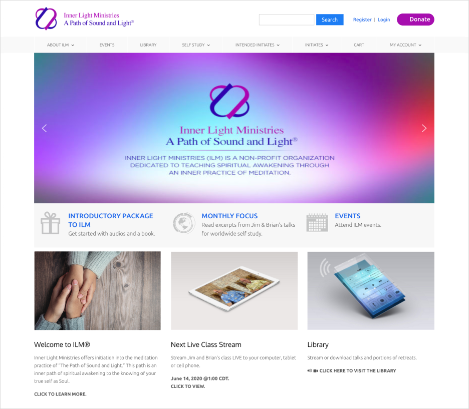
The website uses a serene color palette dominated by shades of purple and blue. These colors are often associated with spirituality, calmness, and trust. The gradient background in the main banner adds a modern touch, creating a sense of depth and visual interest. The soft transition between colors in the gradient reinforces a feeling of peace and tranquility, aligning with the site’s focus on meditation and spiritual awakening.
Typography
The typography choices are clear and legible, which is important for readability and accessibility. The main font appears to be a clean sans-serif typeface, providing a contemporary and straightforward look. This choice supports easy reading, which is essential for a site providing educational and spiritual content.
Call to Actions (CTAs)
CTAs such as “Donate” and “Learn More” are prominently displayed, with contrasting colors that draw attention. This use of color contrast effectively highlights these important actions, encouraging user interaction and engagement.
Responsive Design
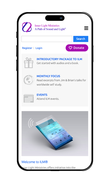
While the screenshot provided does not display responsiveness, the design elements suggest that the site is likely designed to be responsive. The grid layout, clean typography, and appropriately sized buttons and icons all point towards a user-friendly experience across various devices.
Use of White Space
There is ample use of white space throughout the homepage, which prevents the design from feeling cluttered and allows each element to breathe. This not only improves readability but also helps in directing the user’s focus to different sections sequentially.
Website:
Technologies:
WordPress, JavaScript, PHP, Figma.
Customer:
oino.tech
FAQ
1. How can I create a website for my spiritual business?
To create a website for your spiritual business, start by choosing a platform like WordPress or Wix. Select a calming, intuitive template that aligns with your brand. Add essential pages such as “About Us,” “Services,” and “Contact,” and include features like appointment scheduling and blog posts for spiritual insights.
2. What is the best way to create a website for a non-profit organization?
The best way to create a website for a non-profit organization is to use a platform that offers non-profit discounts, like Squarespace or WordPress. Ensure the site includes clear calls to action for donations and volunteer signups, an events calendar, and stories about your mission to inspire visitors.
3. What should I look for in a charity website template?
When selecting a charity website template, prioritize features like a donation button, event registration forms, and a section for success stories or testimonials. Choose a template with a clean, responsive design to ensure accessibility and engagement on both desktop and mobile devices.


