


Typeface selection is not just about choosing a pretty font – it’s a design decision that can make or break your message. A meticulously crafted typeface family ensures legibility and resonates with your target audience. Therefore, getting your typeface selection right can elevate the impact and success of a design.
The classification of typeface families traces back to the innovative work of Francis Thibaudeau, a French typographer who laid the foundation in 1915. Building upon Thibaudeau’s groundwork, Maximilien Vox expanded the classification in 1954. In a quest for refinement and standardization, the International Typographic Association stepped in and meticulously honed the categorization, resulting in the widely recognized Vox-ATypI Classification of typefaces in 1962.
The Roman Typeface Family
Originating from ancient Roman inscriptions, the Roman typeface family exemplifies a timeless and classic typographic style. Such typefaces radiate elegance, readability, and tradition, emphasizing the significance of typeface selection in capturing these attributes.
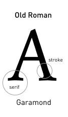
Roman typefaces typically feature serifs, which are small decorative strokes extending from the letters’ main strokes. The serifs in Roman typefaces are usually bracketed, meaning they have a slight curve or transition where they meet the main strokes.
Characterized by serifs and a refined aesthetic, Roman typefaces encompass various subcategories:
Old Roman features curved and bracketed serifs, moderate stroke contrast, vertical stress, and elegant proportions, creating a refined and classic aesthetic.
Transitional Roman are distinguished by their moderate contrast between thick and thin strokes, refined serifs that are less bracketed than Old Roman, and a balance between classical and modern design elements, resulting in a harmonious and versatile appearance.
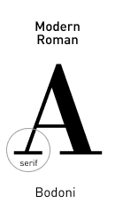
Modern Roman exhibit serifs with a 90° angle, high contrast between thick and thin strokes, horizontal stress, hairline serifs, and a departure from traditional design elements, showcasing a sleek and contemporary aesthetic with a sense of sharpness and sophistication.
Roman typefaces are widely used in various design applications, such as books, magazines, formal documents, and branding, where their refined and balanced appearance conveys a sense of sophistication and professionalism. They are not recommended in cases where the design goal is to create a highly modern or minimalist aesthetic and in certain contexts where screen space is limited, such as mobile devices or narrow columns.
The Egyptienne Typeface Family
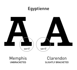
The Egyptienne typeface family is a distinctive category known for its bold and eye-catching presence. For those seeking boldness in typeface selection, the Egyptienne typeface family stands out. Drawing inspiration from the aesthetics of ancient Egypt, these typefaces are iconic for their heavy and square-shaped serifs. The letterforms exhibit a strong and robust appearance, making them highly suitable for headlines, posters, and attention-grabbing designs.
Egyptienne typefaces are characterized by their bold, square-shaped serifs, strong vertical stress, and slab-like appearance, with unbracketed or abrupt connections and slightly bracketed or adnate examples, resulting in a sturdy and industrial aesthetic.
Egyptienne typefaces are best suited for bold and impactful design applications, such as headlines, posters, logos, and branding materials, where their strong and square-shaped serifs make a striking visual statement. Their commanding presence and distinct style add character and grab attention in designs that demand a bold and attention-grabbing typographic treatment.
The Sans Serif Typeface Family
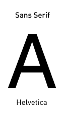
Sans serif typefaces are distinguished by their clean and minimalistic appearance, as they lack the decorative extensions or serifs found in serif typefaces. The term “sans” means “without” in French, indicating the absence of serifs.
Sans serif typefaces feature consistent stroke widths throughout the letterforms, resulting in a uniform and modern look. They are often associated with simplicity, clarity, and a contemporary aesthetic.
Due to their clean lines and straightforward design, sans serif typefaces are commonly used in digital media, interfaces, and signage, as they tend to be more legible on screens and at small sizes. They offer excellent readability and are well-suited for conveying information in a direct and efficient manner. Sans serif typefaces vary in style, ranging from geometric and minimalist designs to more humanist and rounded forms, providing versatility for a wide range of design purposes.
Conclusion
Typeface selection is about echoing the right sentiment. As you embark on design projects, may your typeface selection amplify your message. Whether it’s the traditional charm of Roman, the commanding presence of Egyptienne, or the modern simplicity of Sans Serif, every typeface holds the power to elevate design.
If you enjoyed this content, don’t miss our article on UI Do’s and Don’ts to Master User Interfaces and Boost Your Business! Uncover the secrets of crafting intuitive and captivating user experiences that will take your business to new heights.
