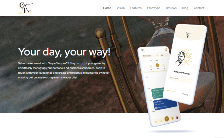
Every app needs a website for promotion. For Carpe Tempus, we built a user-friendly product page that goes beyond just advertising the app. We focused on understanding our client’s needs while designing the app.

Building the Carpe Tempus Website
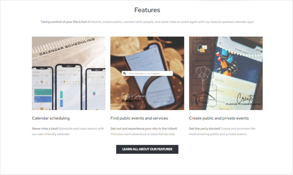
Our goal was to make a digital space that showcases Carpe Tempus’s time management and connectivity features. We aimed for a website that was easy to use and highlighted the app’s essential features, from seamless calendar scheduling to the discovery and creation of events.
Combining Art and Functionality
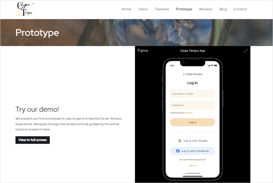
We used visual designs and an interactive Figma prototype to make the Carpe Tempus product page engaging and easy to navigate, reflecting the app’s user experience. This integration of art and functionality was crucial in making the website as captivating and user-friendly as Carpe Tempus itself.

More Than Just a Website
We aimed to capture the essence of Carpe Tempus, creating a product page that doesn’t just share information but also draws visitors to engage with the app’s unique features. The result? A product landing page that serves as more than just an information hub – it’s a gateway to a more organized, connected, and fulfilling lifestyle.

About Carpe Tempus: Revolutionizing Time Management
Carpe Tempus is more than just a calendar app; it’s a comprehensive tool designed to enhance personal schedule management. It empowers users to stay connected, never miss vital events, and find local activities and services. User feedback lauds its ease of use, versatility, and the integration of multiple calendars, making it an essential tool for efficient schedule management.
Synchronizing App Brilliance and Web Excellence
We meticulously tailor the website to echo the app’s spirit and functionality. This synchronization ensures a seamless user experience, bolstering brand consistency and credibility. It’s not just about making two separate entities; it’s about weaving them into a single, compelling narrative.
So, when users land on the product page, they’re not just informed; they’re immersed, ready to download and engage. That’s the magic of perfect synchronization – it turns visitors into users, and users into fans.


