Project Overview
America Realty Group, a leading real estate company, approached us with a clear vision: to revamp their brand identity. Our mission was to create a design that not only resonates with their values but also stands out in the competitive real estate market. We developed a comprehensive brand design and style guide that encapsulates the essence of America Realty Group.
Target Audience
This project is aimed at enhancing the visual presence of America Realty Group, making it more recognizable and appealing to potential clients. The new brand design is intended for use across various marketing materials, business cards, and digital platforms, ensuring consistency and professionalism.
Technology Choices
To achieve the desired outcome, we utilized a combination of Adobe Illustrator and Photoshop. These tools allowed us to create precise and high-quality graphics that are essential for a professional brand design. Illustrator was particularly useful for creating scalable vector graphics, ensuring that the design looks impeccable on both large billboards and small business cards. Photoshop helped us fine-tune the visuals and integrate them seamlessly into various formats.
Design Elements
Business Cards
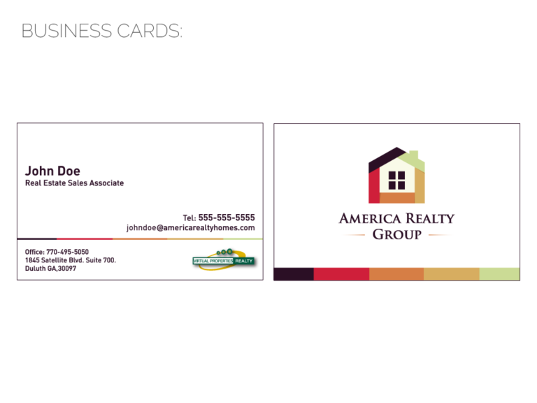
The new business card design is clean and professional. It features a minimalist layout with essential contact information prominently displayed. The use of the company’s logo and brand colors adds a touch of elegance and ensures brand recognition.

Color Palette
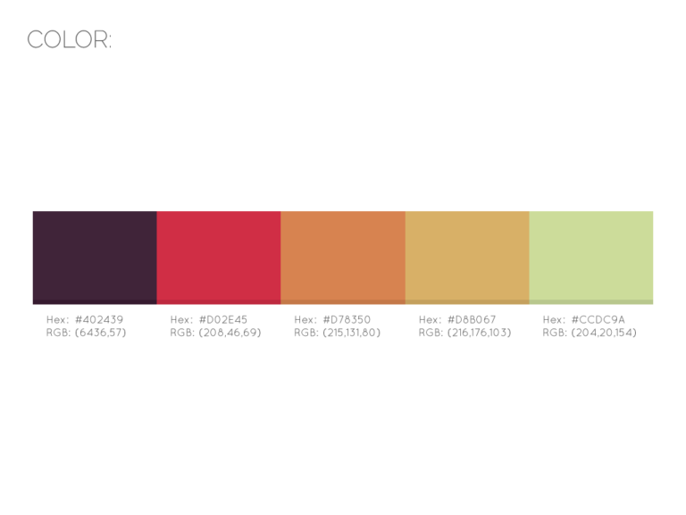
We selected a color palette that conveys trust, warmth, and reliability. The primary colors include a deep maroon (#402439), a vibrant red (#D02E45), a warm orange (#D78350), a golden yellow (#D8B067), and a soft green (#CCDC9A). These colors work harmoniously to create a welcoming and trustworthy brand image.

Logo and Icons
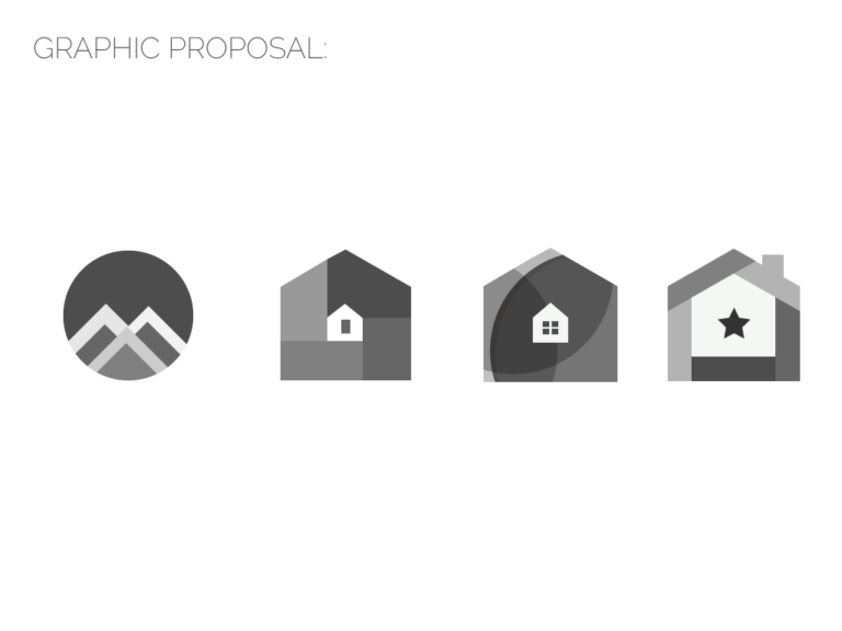
We explored various graphic concepts, ultimately choosing a house icon that symbolizes home and security. This icon is versatile and can be used across different marketing materials.

Typography
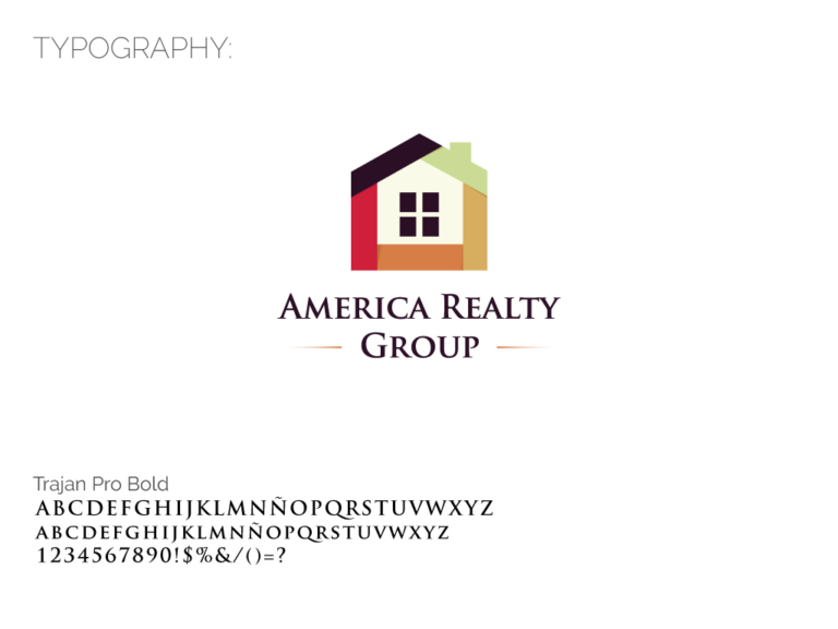
The chosen typeface, Trajan Pro Bold, is elegant and timeless, adding a touch of sophistication to the brand. Its clean lines and readability make it perfect for both print and digital media.
For more details on America Realty Group, visit their website.

Website:
Technologies / Techniques:
Illustrator, Design, Photoshop.


