


This topic is not just part of my job — it’s personal. My dad is color blind, and I learned early on what that means in everyday life. Colors that get mixed up, signals that don’t make sense, and interfaces that frustrate.
So every time I design, I ask myself: Could my dad use this without a problem? That question is my compass. Because designing with empathy isn’t a nice-to-have: it’s the starting point.
Color Blindness: More Common Than You Think
Color blindness affects about 8% of men and 0.5% of women. And no, it doesn’t mean seeing in black and white. The most common types are:
- Deuteranopia: difficulty distinguishing greens
- Protanopia: difficulty with reds
- Tritanopia: trouble with blues and yellows (less common)
Ignoring these variations can turn a simple interaction into a frustrating or even unusable experience.
Tips for Color Blind-Friendly Design
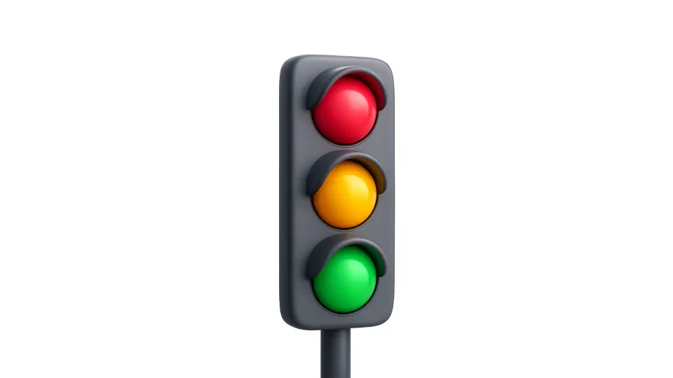
1. Don’t Rely on Color Alone
If your green button means “accept,” add an icon or label. Error messages shouldn’t be marked only in red — provide a clear message as well.
2. Use Textures, Icons, or Shapes
Tools like Trello do this well: they apply patterns to color labels so users can recognize them without relying on color.
3. Prioritize Contrast — Please
Good contrast improves readability for everyone. According to WCAG guidelines:
- Minimum 4.5:1 contrast ratio for normal text
- Minimum 3:1 for large text
4. Give Users Control
If your product allows users to customize color schemes (like Slack does), you’re doing it right.
Where to Apply These Practices?
Short answer: anywhere with an interface:
- Websites: with CSS and accessible modes
- Mobile apps: respecting system-level preferences
- Tools like Asana or Notion: clear icons and labels
- Charts and maps: use textures or shapes, not just color
- Games and educational apps: don’t make team color the only cue
Useful Tools for Designers
- Stark (for Figma, Sketch, XD): simulates types of color blindness
- Color Oracle: shows how your screen looks with color blindness
- Coblis: free online simulator
- ColorBrewer: generates accessible palettes for data visualizations
Designing with Empathy = Designing Well
Considering people with color blindness isn’t a minor detail. It’s part of designing responsibly. It’s not about doing something special — it’s about doing things right for everyone.
Because when your product is more accessible, it’s also clearer, more usable, and more loved.
And yes — if it works for my dad, it’ll probably work for everyone.
Let’s keep that in mind. Always.
