


If you’ve seen the memes comparing the cluttered homes we grew up in, to the ultra-minimalist spaces we live in now, you know the story. Our kitchens were once overflowing with mismatched mugs and gadgets, but now, our homes—and our websites—are all about clean lines and simplicity.
Ver esta publicación en Instagram
While this minimalist trend has transformed our living spaces, it’s also taken over web design. But in the quest to create the sleekest, cleanest websites possible, have we gone too far? Is it possible that we’ve stripped away not just the excess, but also the essentials?
How We Arrived at Web Design Minimalism
Web design has undergone a major transformation in the past two decades. The once vibrant, text-heavy, and often chaotic websites of the early 2000s have been replaced by sleek, minimalist designs. Today’s websites are all about clean lines, white space, and as few elements as possible. While this shift has undoubtedly led to more visually appealing and modern websites, it has also introduced some serious usability challenges.
When Less Becomes Less Usable
Imagine visiting a website where you’re greeted by a vast expanse of white space with a single line of text and maybe a button or two. It’s visually stunning, but where do you go from here? What should you click on? What’s this site even about?
This is the paradox of extreme minimalism: it looks beautiful, but it can also leave users feeling lost, unsure of what to do next. In our pursuit of simplicity, we’ve sometimes stripped back so much that we’ve taken away the very elements that help users navigate and understand a website. It’s like walking into a perfectly curated, but nearly empty, room and not even being sure where the door is.
Real-World Examples of Minimalist Mishaps
Let’s look at a couple of real-world examples that illustrate the potential pitfalls of ultra-minimalist design:
Transaction History Confusion
While the design is clean and uncluttered, it introduces a couple of significant usability issues.
- Accessibility: The lack of contrast between elements could be an accessibility barrier. The subtle color differences might look sleek, but they can make it challenging for users with visual impairments or older screens to distinguish between different parts of the interface. Clear, high-contrast elements are crucial for ensuring that everyone can comfortably navigate and understand the content.
- Visual Hierarchy: There’s not much differentiation between elements. Everything is similarly weighted, so it’s easy to miss important details like pending transactions or larger sums of money.
- Lack of Data: Another issue is the decision to “save space” by not repeating the dates for transactions that occur on the same day. While this might seem like a smart, minimalist move, it can actually lead to confusion. Users scanning through their transactions might lose track of which date a particular transaction occurred on, especially if the list is long or they are quickly browsing through it. Repeating the date in each row, even if it feels redundant, provides a clear and consistent reference point that enhances usability.
Settings Menu Frustration
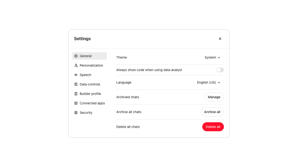
- Flat Design Confusion: The flat design style, which avoids distinct visual separations like raised buttons or shadows, can indeed make it difficult to understand what is interactive and what isn’t. In this particular screenshot, the lack of vertical lines or clear demarcations between sections creates confusion. It’s not immediately obvious whether the elements are organized in columns or if items are nested under others. This could lead to user frustration as they might mistakenly click on something thinking it’s a separate column or item when it’s actually part of another option.
- Lack of Explanations: The minimalist approach means there are no descriptions or contextual help for each setting. For example, the option “Always show code when using data analyst” is vague and might be confusing for users who aren’t familiar with this feature. Without any further information or tooltips to clarify what each option does, users are left guessing. This could lead to hesitation or even the avoidance of certain settings, ultimately diminishing the usability of the interface.
A Walk Down Memory Lane: Comparing Old and New Web Designs
To better understand how web design has evolved—and the potential pitfalls of extreme minimalism—let’s compare some iconic websites from the early 2000s to their modern counterparts.
The New Yorker: 2000 vs. Today
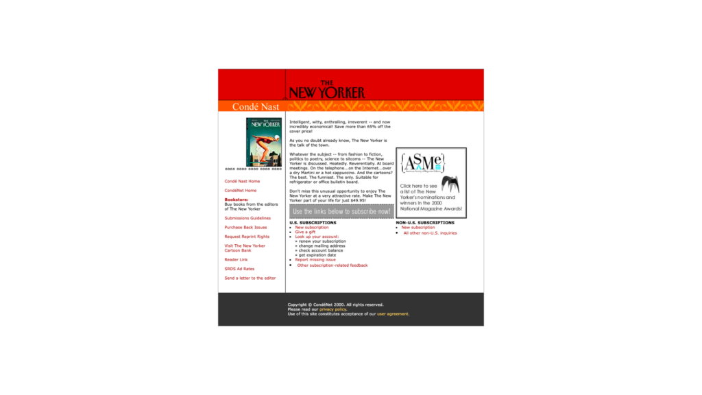
Back in 2000, The New Yorker’s website was a busy hub of information. Text-heavy, with small images, multiple navigation menus, and links packed into every corner, it was functional but could be overwhelming—much like a room filled with too much furniture and knick-knacks.
Today, The New Yorker’s website is almost unrecognizable. The homepage typically features a striking, full-screen image, usually an illustration from a current article, accompanied by a few lines of text. The navigation is minimal, tucked away in a small menu, and the white space is abundant. It’s visually arresting, but some users might find it too sparse, wondering where all the content has gone.
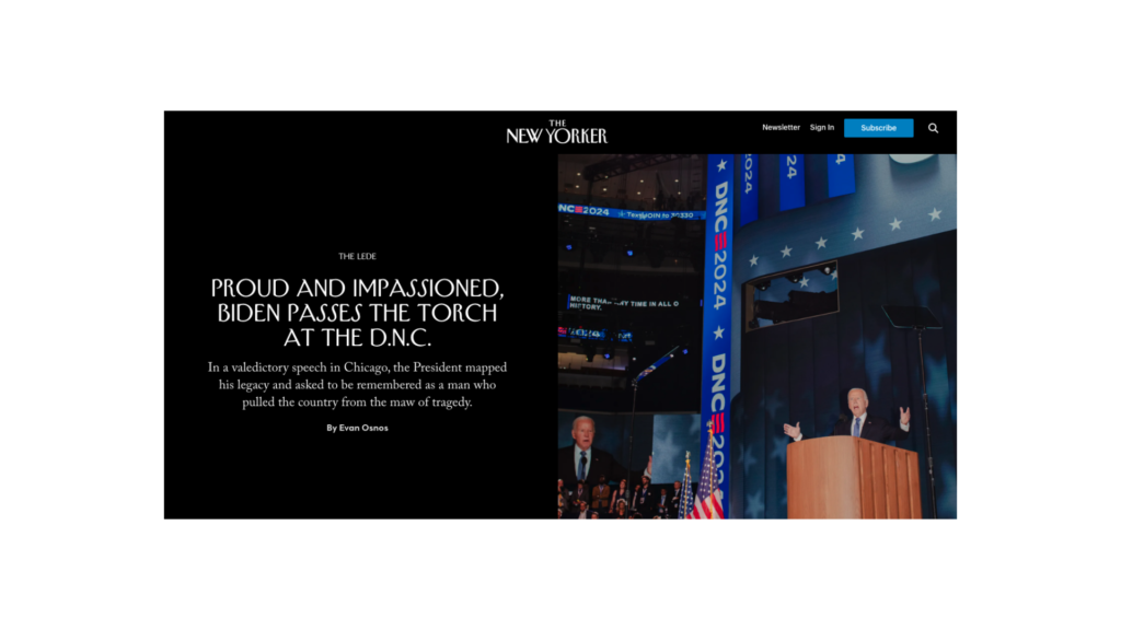
Takeaway: The New Yorker’s transformation highlights how minimalism can enhance visual appeal but also raises concerns about whether the balance between aesthetics and usability has tipped too far toward the former.
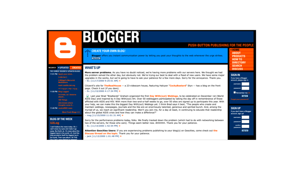
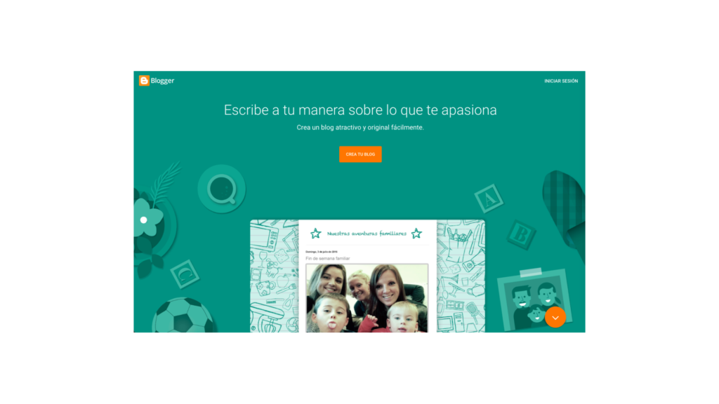
Blogger: 2000 vs. Today
In 2000, Blogger was the wild west of web design. The site was colorful, text-heavy, and filled with links—reminiscent of a comic book page where every inch of space was crammed with something to read, click, or sign up for. It was vibrant and full of energy, reflecting the DIY spirit of early blogging, but could be chaotic and confusing for new users.
Today, Blogger has fully embraced the minimalist trend. The homepage is dominated by a single, soothing color, a large call-to-action button, and plenty of white space. Gone is the visual clutter, replaced by a calm and serene user experience. But with so few elements on the screen, some users might find the site too minimalist, leaving them unsure of where to start or what the site has to offer.
Takeaway: Blogger’s evolution showcases the shift from content-rich, visually busy design to a pared-down aesthetic that prioritizes simplicity. While this makes the site feel more modern, it also risks alienating users who need more visual cues or information.
Striking the Right Balance
The shift towards minimalism in web design has undoubtedly brought many benefits: cleaner layouts, improved readability, and a more polished look. But as these examples show, there’s also a trade-off. In stripping away the clutter, we may have also stripped away some of the elements that help users navigate and engage with a website.
The key is balance. Minimalism should enhance the user experience, not detract from it. While it’s important to create a clean and beautiful interface, it’s equally important to ensure that users can easily find the content they’re looking for and understand how to navigate the site.
Conclusion: Designing for the User, Not Just the Aesthetic
Minimalism in web design can create beautiful, calming spaces, but it shouldn’t come at the expense of usability. As we continue to embrace cleaner, simpler designs, let’s remember that the ultimate goal is to create a seamless, enjoyable experience for the user—not just a pretty page to look at.
So next time you’re designing that ultra-minimalist website, ask yourself: Have I cut back too much? Is this space so clean it’s confusing? Because at the end of the day, no one wants to feel like they’ve wandered into a room with no clear way out—whether it’s a living room or a website.
