


Every detail in web design is pivotal in crafting an engaging user experience. The decision between adopting a vertical or horizontal layout can profoundly affect your website’s accessibility and user interaction—similar to selecting your outfit for the day, whether it’s a raincoat for stormy weather or a t-shirt for a casual outing, each choice serves a distinct purpose.
Let’s explore the differences between vertical and horizontal layouts, highlighting their impact on user engagement, information delivery, and the overall aesthetic appeal of websites.
Understanding Eye Movement: The Key to Effective Content Consumption
Grasping the role of eye movement in reading and processing information is vital before we delve into the advantages and disadvantages of each layout.
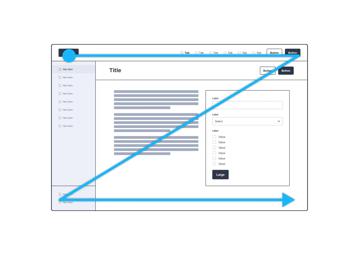
Typically, our eyes follow a Z-pattern across web pages in left-to-right (LTR) reading cultures: beginning at the top left, moving horizontally to the right, then diagonally back to the left lower quadrant, and across again. This natural scanning behavior underscores the importance of aligning the layout of information with user expectations.
The Vertical Layout: Standing Tall and Proud
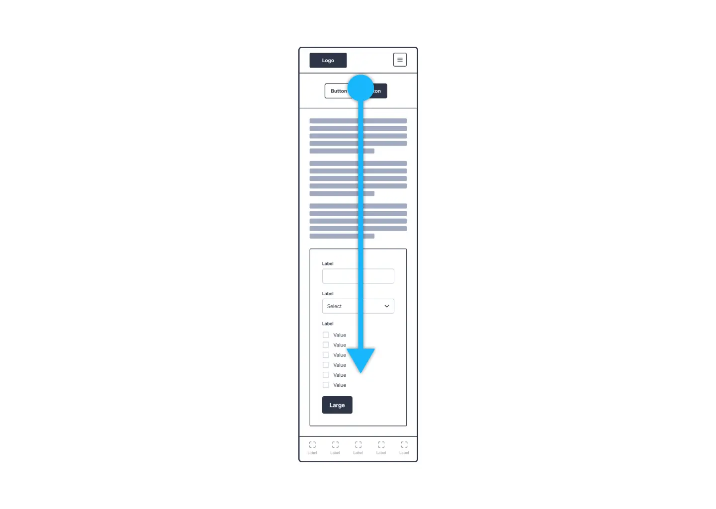
Vertical layouts are like the skyscrapers of web design – they make the most of limited space and are perfect for scrolling through on mobile devices.
Pros:
- Mobile Optimization: Designed for scrolling, vertical layouts excel on mobile screens, enabling smooth navigation.
- Emphasis on Visual Content: Portrait orientation prioritizes imagery, suited for visually-driven content.
- Content Depth Without Width: Vertical layouts allow for focused content exploration without extensive horizontal space.
Cons:
- Narrow Horizontal Space: This can result in cramped text and elements, affecting readability.
- Scrolling Fatigue: Excessive vertical scrolling can overwhelm users, particularly on content-rich sites.
Horizontal Layouts: The Wide World of Web Design
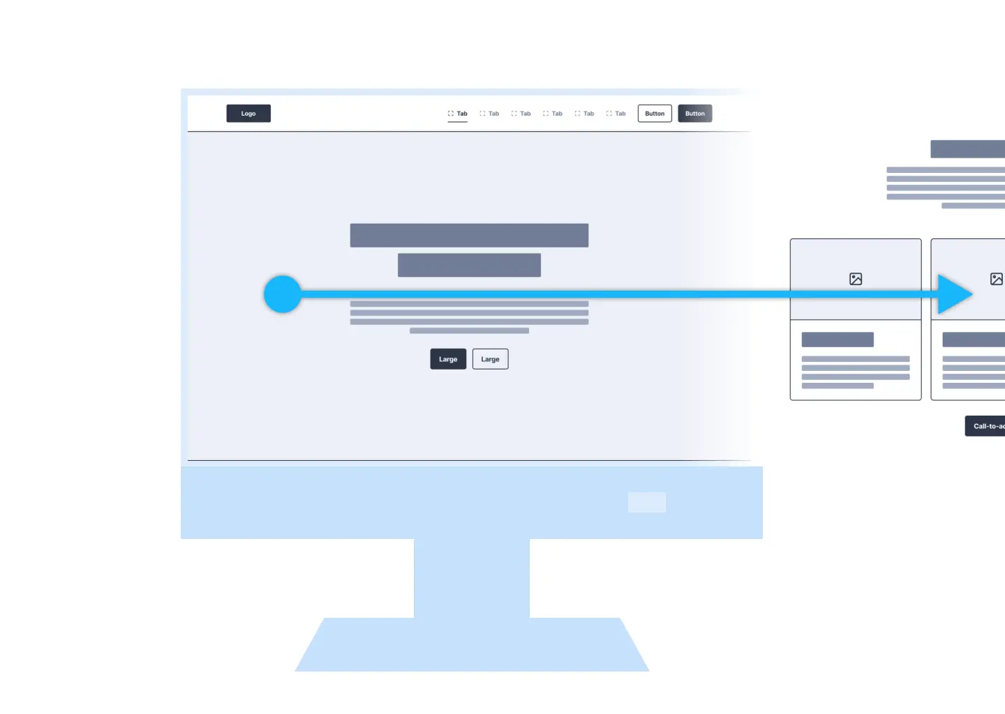
Horizontal layouts are like sprawling landscapes – there’s so much room to explore, making them a hit for desktop browsing.
Pros:
- Comprehensive Information Presentation: Ample space for text and visuals, suitable for content that requires detail and visual balance.
- Scroll Reduction: Utilizes screen width to display more content at once, minimizing the need to scroll.
- Alignment with Eye Movement: Enhances readability and user engagement by aligning with natural eye movement on desktops.
Cons:
- Desktop-Centric: Effective on large screens but may feel constrained on mobile devices.
- Visuals vs. Text Competition: Potential for images and text to vie for attention, possibly diminishing the impact of visuals.
Right-to-Left (RTL) Script: Global Design Perspectives
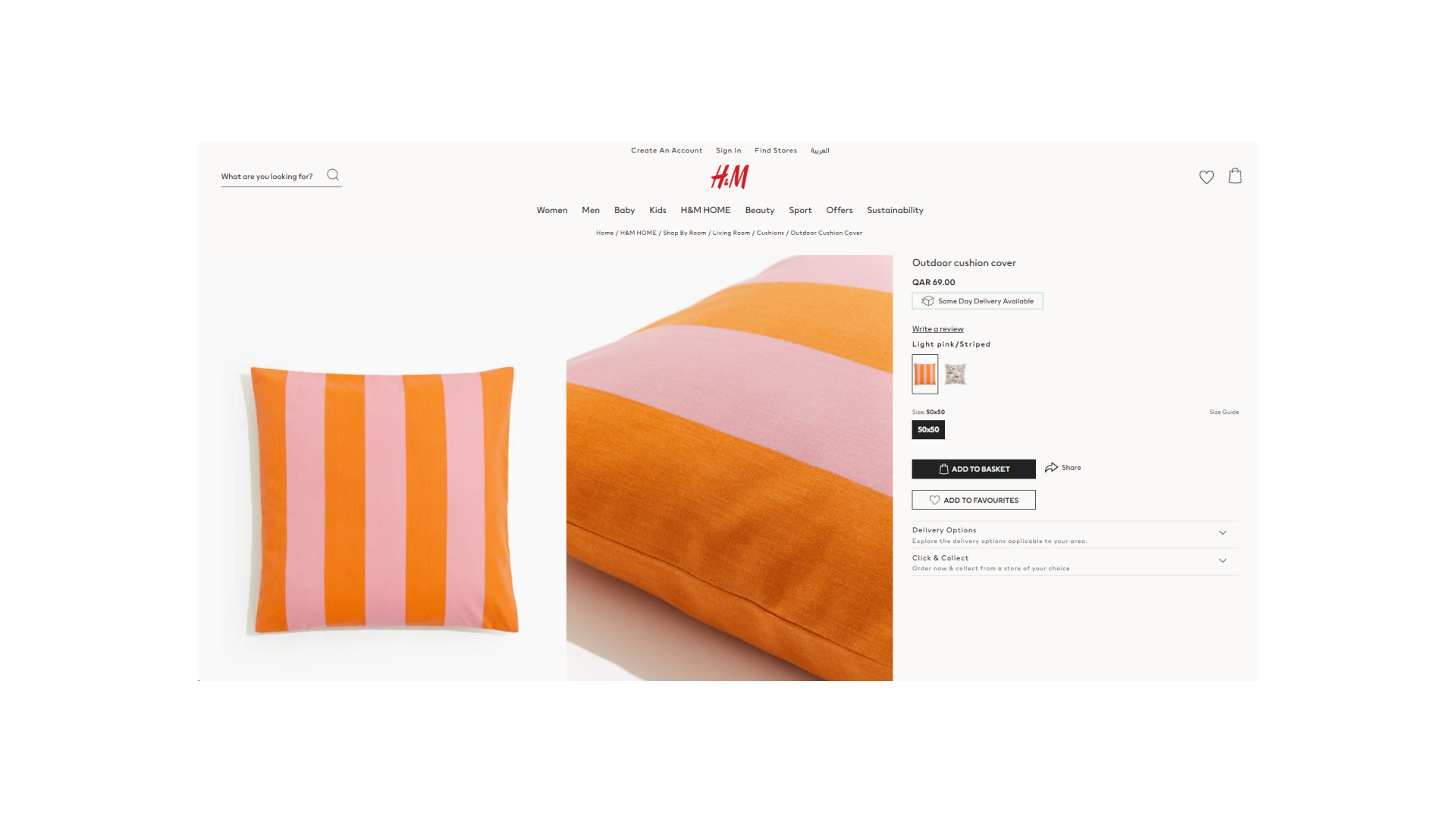
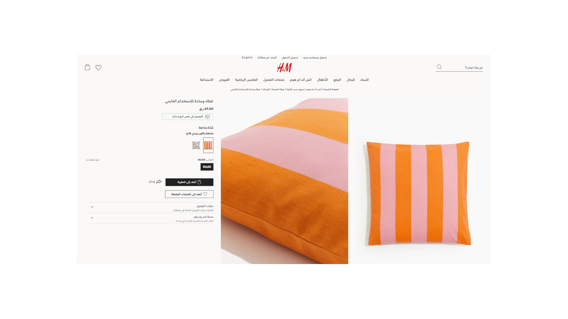
Designing for a global audience requires understanding and accommodating right-to-left (RTL) scripts.
What’s RTL, Anyway?
RTL refers to languages and scripts that are read from right to left, which is the opposite of the left-to-right reading direction of languages like English. Examples of RTL languages include Arabic, Hebrew, Farsi (Persian), and Urdu.
Accommodating RTL scripts involves more than simply adjusting text alignment; it necessitates a mirrored approach to the overall layout, navigation, and content organization. This holistic strategy is crucial for creating intuitive and effective user experiences that respect the natural reading flow of users who read RTL languages.
Design Adjustments for RTL Layouts:
- Mirrored Layouts: Reflect the structure of your website or application to align with RTL reading habits, placing navigation elements and important content on the right.
- Text Alignment: Align text to the right side of the page or container, ensuring it matches the reading flow of RTL languages.
- Visual and Textual Harmony: Consider the placement of images, icons, and other visual elements in relation to text, ensuring they support rather than disrupt the RTL reading flow.
- Testing with RTL Audiences: Conduct usability testing with RTL readers to identify and address any navigational or comprehension challenges.
Making a Decision: Think of Diverse Audiences
Choosing the right layout—vertical, horizontal, or tailored for RTL—depends on your site’s content and your audience. It’s about making your design welcoming to everyone, no matter how they read.
In the RTL languages case, applying mirrored layout principles ensures your design is inclusive and accessible to all users, regardless of their reading direction.
User-Centric Experiences: At the Heart of Design
In the quest to create engaging and accessible web designs, considering the natural eye movement patterns and reading habits of your audience—whether LTR or RTL—is paramount.
By adapting layouts to suit different scripts and cultural practices, designers can craft experiences that resonate with a diverse global audience, ensuring content is delivered as effectively and inclusively as possible.
