


Sometimes I wish I could be a fly on the wall during Apple’s design meetings. In the latest clash between Team “Let’s Make It Dazzling” and Team “Let’s Make It Accessible,” the sparkle squad clearly won.
Where Did This “Liquid Glass” Design Come From?
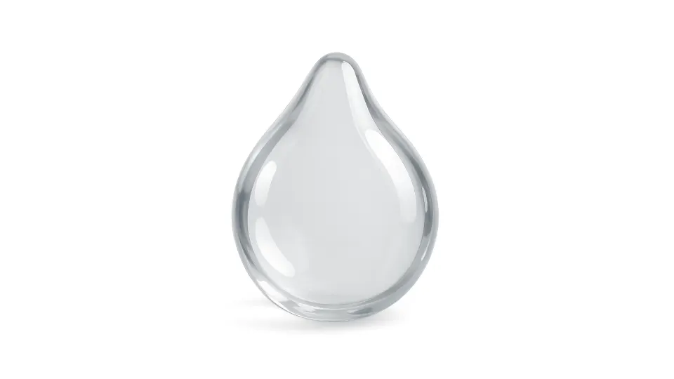
Apple (who, let’s be honest, competes mostly with itself at this point) rolled out a new iOS version featuring a highly polished look that’s been dubbed “Liquid Glass.” It’s a translucent, glossy interface that layers elements like smooth sheets of digital glass—complete with reflections, blur, and depth.
Is it different? Definitely.
Is it pretty? Most people think so.
Is it usable? …Well, that’s where things get complicated.
Is Apple Still Doing Minimalism?
They say it’s minimalism. But here’s the twist: stacking multiple translucent layers actually creates a visually noisy experience. You’ve got content showing through content, with dynamic wallpapers in the background adding more motion and color. It’s minimalism dressed in maximalist vibes.
It’s a strange aesthetic middle ground—clean, but overloaded. Some love it. Others (especially those who just want to read their screen without squinting) not so much.
Now for the Big One: Usability
Here’s where accessibility comes in. Yes, the new iOS design is shiny and sleek. But translucent layers + fancy blur effects = a headache for usability, especially for users with visual impairments.
Analysts have pointed out major readability issues in iOS 26. And users? They’ve had their say—less formally, of course.
It gets worse with dynamic wallpapers—like those lovely rotating vacation shots, pet photos, or your kids at the beach. When the UI is built on semi-transparent folders and icons, those shifting backgrounds create a chaotic blur of colors and movement. Suddenly, finding your Notes app becomes a scavenger hunt.
And let’s not forget: accessibility isn’t optional. It’s a legal and ethical requirement for tech companies. So… why does this feel like an afterthought?
How to Tone Down the Liquid Glass Effect
If you’re feeling the eye strain, Apple did throw us a lifeline: a toggle to reduce transparency.
Go to:
Settings → Accessibility → Display & Text Size → Reduce Transparency
That single toggle makes UI layers more opaque, improving contrast and legibility. (Point for Team Accessibility.)
To be fair, Apple also introduced Braille display support, higher contrast modes, and adjustable font sizes—all helpful for minimizing the impact of Liquid Glass on daily use.
Final Thoughts: The Battle Between Wow and Usability
This update leaves us with some real questions:
- Will Apple roll things back if enough users complain?
- Can they find a balance between stunning visuals and inclusive design?
Only time will tell. But one thing’s clear: innovation should never come at the cost of excluding people. If it takes ten taps and a tech-savvy friend with 20/20 vision just to see your screen again, maybe it’s time to rethink the priorities.
Let’s hope that next time, both design teams get in the same room—and bring the users with them.
