


On June 26, during Figma Conf, I watched as the new interface of the program (Figma UI3) was unveiled, generating plenty of buzz and a bit of skepticism. Figma, the tool I’ve relied on for years to create user interfaces, introduced many changes—some of which were controversial—but none went unnoticed.
One of the boldest changes? Floating panels. At first, I thought this sleek, modern twist on the design tool’s layout might be a leap forward. But as I started interacting with UI3, it quickly became clear that this change wasn’t quite the improvement I’d hoped for.
The Problem with Floating Panels: Why They Didn’t Work
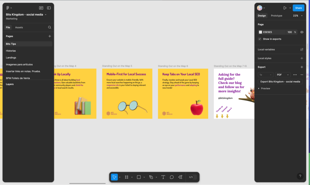
Of all the UI3 changes, the most controversial by far was making the navigation panel, properties panel, and toolbar both floating and collapsible. Like many others, I tend to be open to changes, but something about these floating side panels just didn’t sit right with me.
It wasn’t just confusion or dissatisfaction I felt—it was discomfort. Watching my workspace elements slip through the small gaps between the edge of the panel and the workspace itself was unsettling. The floating panels blurred the lines between my tools and the canvas, creating visual clutter that actually hurt usability more than it helped.
User Feedback: A Clear Sign of Discomfort
It wasn’t just me who felt this way. Users everywhere, including myself, shared our frustrations on forums, LinkedIn, and anywhere we could. The reaction was clear: Figma’s floating panels weren’t delivering the experience we expected.
Figma did respond, applying a subtle gradient behind the panels to reduce the visual noise caused by that awkward 12px gap. While this tweak helped a little, it didn’t solve the real problem: Why were these panels floating in the first place? If the goal was to “gain” a little more visible workspace, it simply didn’t hit the mark. Instead of freeing up space, the floating panels created odd gaps that disrupted the workflow.
A Bold Idea, but the Wrong Solution
As I dug deeper, reading through Figma’s documentation, user feedback, and community discussions, it became clear that the floating panels just didn’t work in real-world usage. The innovation was bold, but the execution didn’t serve the users’ needs—my needs. This was a case where aesthetics seemed to have taken precedence over user experience, and that’s where things went wrong.
The Power of Admitting Mistakes in Design
Here’s where Figma really impressed me. In design, being able to admit when something doesn’t work is a valuable skill—one I’ve learned over the years. And Figma did just that. After months of listening to feedback from users like me, they’re reverting back to fixed panels. They recognized their misstep and made the call to fix it—proving that acknowledging and addressing mistakes is one of the most powerful moves a company can make.
On October 10th, Figma will roll out this update, a clear example of how recognizing when a design fails can lead to meaningful improvement.
This isn’t about failure—it’s about a commitment to continually improving the user experience. Figma’s decision to abandon floating panels highlights how responsive it is to its community.
Reimagining the Solution: My Take
Instead of floating panels, I believe there’s a better solution—and I can’t wait to see how Figma handles it. But first, let’s break down what was lost when panels were floating.
Those 12px gaps between the panels and their margins? Completely wasted space. They served no practical purpose for displaying or manipulating any elements, which is exactly what you want in a tool designed to maximize workspace visibility.
Here’s why reverting to fixed panels makes sense to me:
- More workspace: By removing floating panels, we’ll regain 24px of horizontal space—allowing for a much clearer, more visible workspace.
- Clear boundaries: Fixed panels bring back the visual clarity that was missing, helping me stay focused and making everything feel more structured.
- Collapsing panels remain an option: Even with fixed panels, I still have the flexibility to collapse them if I need more room—without the visual clutter of floating elements.
I’m looking forward to the October 10th update when Figma brings this practical solution back.
Embracing Iteration: Figma’s Commitment to Improvement
The decision to remove floating panels is a perfect example of the power of iteration. In design, not every bold idea is a winner, and that’s okay. What separates great designers and companies from the rest is their ability to recognize when something doesn’t work and pivot toward a better solution.
By going back to fixed panels, Figma is showing a level of humility and dedication to the user experience that I deeply appreciate. Sometimes, the best design decision is simply the one that gets out of the user’s way. Figma’s ability to listen to users and respond shows that they’re always striving for improvement—even if that means changing course.

Conclusion: The Lessons of Figma’s Floating Panels
For me, the story of Figma’s floating panels serves as a powerful reminder of how important user feedback and iteration are in design. While the floating panels were a bold experiment, their failure taught a valuable lesson: usability always comes first.
Figma’s willingness to acknowledge the issue, listen to its users, and make necessary changes is what makes it stand out. After five years of using Figma, it’s clear to me that they’re still committed to creating the best design tool possible—by making it more user-friendly, more functional, and more responsive to the needs of their community.
