Ah, logos! They’re more than just a pretty face of a brand, right? As designers, we’ve been around the block, adhering to the sacred rules: reflective of the industry, oozing originality, brimming with conciseness, and by golly, it better be memorable. It’s got to hold its own in stark black and shrink to the tiniest of scales without blurring into an unrecognizable blob.
But hang on a minute. What about accessibility? Are our designs speaking to everyone, embracing every viewer in their unique viewing capacities?
Engaging Everyone: An Inclusive Lens in Logo Design
Inclusivity in design isn’t a mere buzzword; it’s becoming the bread and butter of ethical, forward-thinking design. We’re talking about a universal design that doesn’t just stand out but stands up for every individual, acknowledging and catering to our diverse human tapestry.
- Well-Contrasted Colors
- Legible Fonts
- Graphic Simplicity
Let’s peel back the layers and dive deeper into each point, shall we?
A Palette That Speaks Volumes: Choosing Colors that Communicate
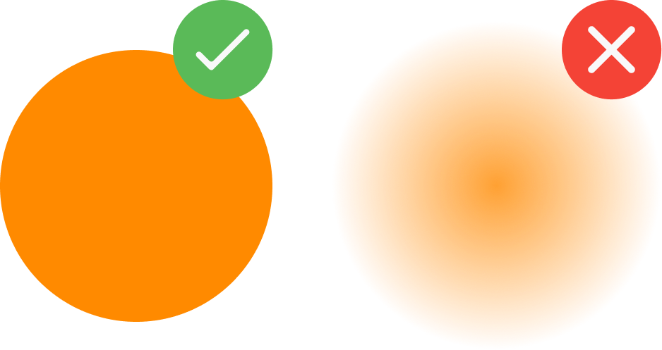
Color: it’s not just a visual feast but a mode of communication, especially when we deliberate on how to create a logo that reverberates through a sea of varied viewers. Nix the pastels and the whispering gradients. Instead, let’s arm ourselves with colors that announce themselves boldly and without ambiguity, ensuring our message doesn’t get lost in the aesthetic sauce.
Fonts That Don’t Play Hard to Get: Easy Reading, Easy Engagement
Sans-serif fonts have long been the darling of legibility, but let’s not pen ourselves into a design corner. The key is stability and clarity in each character, be it a letter or symbol. Heck, if a serif font fits the bill, and does so with panache, why not flirt a little with tradition?

Striking a Harmonious Note with Synthesis: Simplicity and Originality Hand in Hand
Ah, synthesis! It’s an art, crafting a simple, singular form that conveys multifaceted concepts. The “less is more” mantra isn’t new but is golden. A logo that can convey complexity through simplicity isn’t just a win; it’s a slam dunk in design circles.
by Design Studio
A Future-Forward Step: Create a Logo for the Universe of Viewers
Creating a logo that’s not only a beacon of a brand but also an inclusive emblem that envelops every viewer in its communicative embrace—it’s the future, and it’s a bright, accessible one. Branding work often goes beyond the mark itself — for SpotAt, we paired identity with motion in a video that tells the product story.
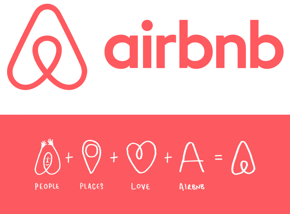
Airbnb image: Design Studio
