Every field has its unique traits and UX challenges, but in healthcare, being gentle and understanding is vital when designing the best healthcare websites, including those for doctors and healthcare clinics.
Healthcare websites typically cater to individuals who are experiencing an illness or recovery, or are supporting a loved one through such a situation. These individuals often find themselves in a vulnerable emotional state, with a heightened sense of urgency and a strong need for information and understanding. Therefore, a healthcare website needs to provide comprehensive and accurate information, as well as guidance to help them navigate their healthcare journey effectively.
By following these key tips, you can create a healthcare website that meets the needs of your target audience. They will help guide you toward building a successful website for a doctors’ family clinic or medical practice.

1 – Patients go first
As a primary care provider, healthcare clinic, or medical practice, your website should cater to your patients’ needs, prioritizing those you serve.
Health-related issues are delicate and you should be mindful when creating the contents. Focus on creating a user-friendly website that provides efficient assistance to patients and families that are struggling with disease.
If you already own a physician website it’s important to ensure that your content is patient-centric. Take a moment to review your website and ensure that it aligns with the needs and expectations of your patients.
2 – The Power of Clarity
Communication is key, and when it comes to healthcare, information must be clear and concise.
Don’t let medical jargon get in the way of understanding. Provide helpful footnotes to clarify unfamiliar terms.
A handy glossary is a great tool to add. It allows you to easily edit and add new terms whenever you need.
3- The Dynamic Impact of Hierarchy
Efficient organization is crucial in assisting your patients in finding the information they need. By using a hierarchical content structure, you can establish a solid foundation for your healthcare website.
You can make your website easier to navigate by adding bullet points, item numbering, and relevant links by sections.
Don’t underestimate the power of a well-located search bar to help users quickly find answers to their queries!
4 – The Value of Designing for Empathy
In today’s healthcare landscape, it’s essential to have a website that not only provides medical information but also supports patients in managing their emotional well-being.
Just like hospitals use soothing furniture colors and subtle paintings to create a relaxing atmosphere, your website should also prioritize patient comfort.
Opt for contrasted color palettes that are accessible and easy on the eyes, but avoid aggressive colors.
When it comes to images, steer clear of explicit treatment content. What may appear as ordinary images to physicians could potentially be overwhelming for patients. A little empathy goes a long way!
5 – The Importance of Accessibility
When designing a healthcare website, prioritizing readability and accessibility is crucial.
Accessibility can be enhanced by incorporating features such as appropriate color schemes, clear contrasts, and code that can be interpreted by assistive technologies.
Additionally, using easily readable fonts and integrating WordPress accessibility plugins can ensure that your website can accommodate a wide range of patients, allowing them to adjust the formatting of the content to suit their individual needs.
The Critical Impact of Added Value
Incorporating value-added features is essential to enhance your healthcare website. Some examples of such features include an online agenda, a location map, easily accessible contact information, a display for Urgent Care Wait Times, or a Quick Check-In module. These tools not only benefit patients but can also streamline workflow for physicians.
If you’re a doctor or clinic manager who believes that having a website is unnecessary, consider this: with just one page, you can provide comprehensive information about your clinic, incorporate chat functionality, and offer an online scheduling system. Having a website makes it easier for patients to find you by name and serves as a professional introduction that can enhance your reputation and garner positive ratings and reviews.


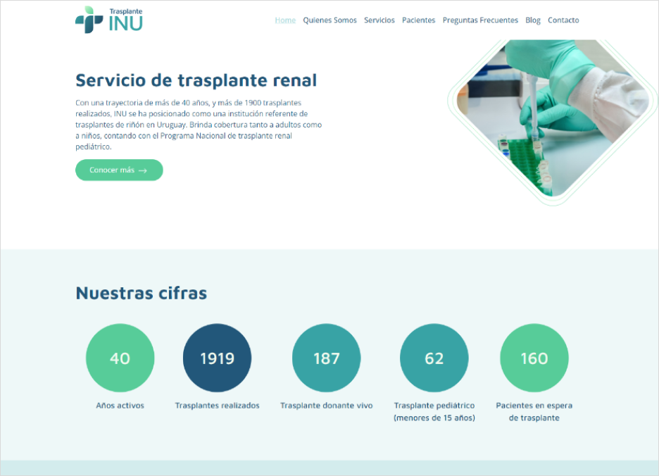
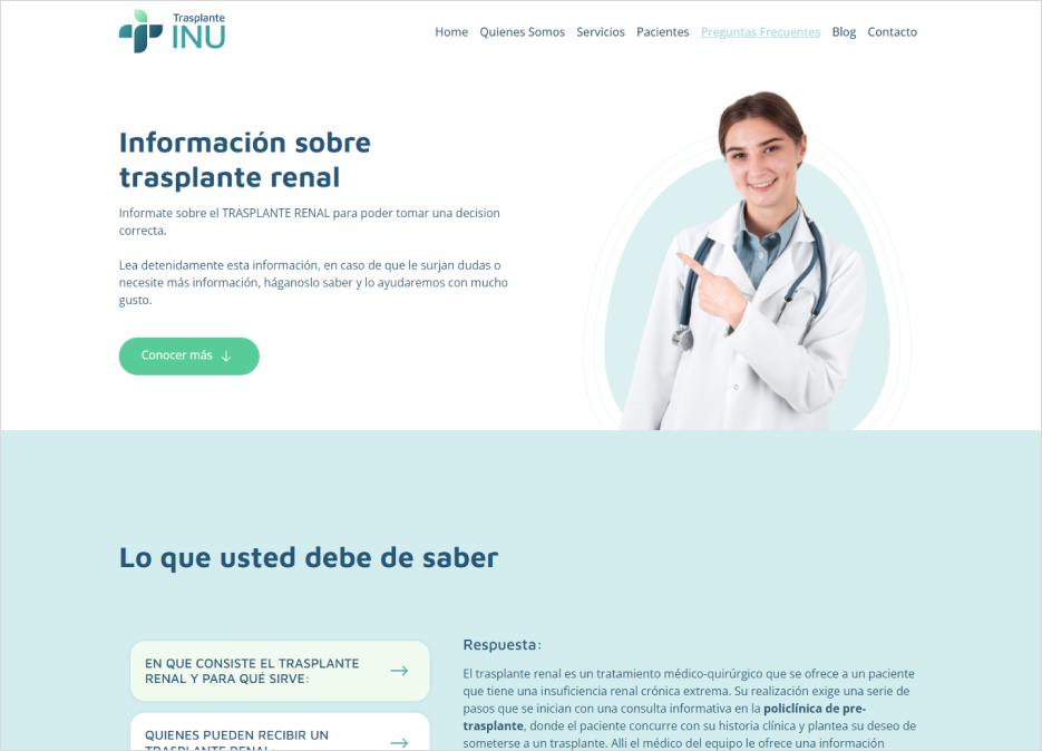
INU’s website is a prime example of our commitment to prioritizing user experience. INU is a website aimed to patients undergoing kidney transplant procedures, with features tailored to both pre and post-transplantation stages.
In this instance, the specialist doctors recognized the importance of being able to upload content themselves. Therefore, we focused on developing a user-friendly CMS that empowers them to make content edits without requiring developer intervention using Figma, WordPress, and Docker technologies.
Check it out at: INU Trasplantes
If you need help creating a healthcare, medical practice, or doctor website, don’t hesitate to contact us. We specialize in creating user-friendly, empathetic, organized, and accessible patient journeys.


