Let’s talk about Gen Alpha—the little ones practically born with tech in hand. This is the generation growing up where swiping, tapping, and speaking to devices feels as natural as breathing. These tiny tech enthusiasts, born roughly between the early 2010s and the mid-2020s, are shaping up to be the most digitally savvy generation yet.
In this series, we’ll explore how to design for these pint-sized users across different age segments: toddlers (2-4), young children (5-7), and preteens (8-12). First up, we’re tackling toddlers—those tiny digital dynamos who seem to learn how to swipe and tap before they even master speaking in full sentences. For them, digital interaction is second nature, and they’re hungry for more!

Key UX Considerations for Toddlers
For these little ones, technology isn’t just a tool—it’s a part of their environment, as familiar as their favorite toy. At this age (roughly 2 to 4 years old), toddlers are beginning to explore and understand the world around them, and screens often play a big role in their early learning and entertainment. They’re working on things like hand-eye coordination, cognitive recognition, and language skills—all while navigating bright and colorful interfaces that are as new to them as the playground. This means that when it comes to UX for toddlers, everything should be simple, safe, and engaging.
Here’s how to design with these young explorers in mind, embracing simplicity and predictability, with a bit of sparkle thrown in:
1. Visual Design: Bright Colors and Simple Shapes
Color and Imagery
Toddlers are naturally attracted to bright colors and simple shapes. Bold, primary colors help grab their attention, while friendly, cartoonish images make digital experiences feel approachable and fun. Too many colors can create visual clutter, so simplicity is key. Characters that convey emotions are also a hit, as toddlers are beginning to recognize and relate to different feelings.
Typography
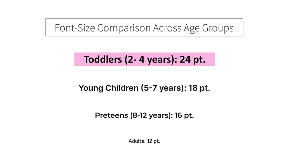
Toddlers aren’t readers yet, but they’re learning to recognize letters and symbols. Use big, bold, sans-serif fonts that are easy to distinguish and friendly in appearance. Stick to single words or even just letters to avoid cognitive overload, and space them out generously for easy recognition.

Icons and Visual Cues
At this age, icons should be straightforward and literal. A house for “home” or a speaker for “sound” are ideal, as they’re intuitive even for toddlers. Adding small animations to icons, like a bouncing ball, can reinforce the purpose and keep their attention.
2. Interactive Design: Touch Targets and Placement
Touch Target Size
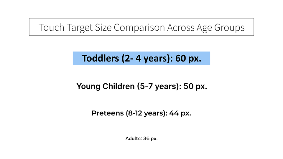
Minimum Size: Touch targets should be at least 44×44 pixels (or around 1 cm square) to accommodate small fingers and minimize accidental taps. Larger targets, such as 60×60 pixels, are even better for younger children who may not have precise motor control.
Spacing Between Elements: Leave sufficient space (at least 8-10 pixels) between interactive elements to prevent accidental touches. This reduces frustration and enhances the overall experience by allowing toddlers to clearly distinguish and select items.

Placement of Elements
Bottom of the Screen: For handheld devices, placing key interactive elements within reach at the bottom of the screen is ideal. Toddlers often hold devices with both hands and use their thumbs or index fingers to interact.
Central Positioning: Toddlers naturally focus on the center of the screen, so place primary interactive elements centrally where they are easy to see and reach.
Avoiding the Top-Right and Top-Left Corners: These areas are harder for small hands to reach comfortably, so reserve them for non-interactive elements or those meant for parents, such as settings or exit buttons (behind parental gates).
Interface Layout and Simplicity
Linear and Simple Navigation: Ensure a straightforward, linear navigation structure with large buttons leading them from one step to the next. This limits the cognitive load and helps them stay focused.
Consistency in Placement: Keep interactive elements in predictable places to build familiarity. Consistency helps toddlers understand where to go next without reorienting themselves.
Gestures and Interaction Patterns
Single Tap: Limit interactions primarily to single taps, which are the easiest for toddlers. Avoid double taps, swipes, or other multi-finger gestures, as they are often too complex at this age.
Avoid Dragging: Drag-and-drop actions can be challenging due to limited hand-eye coordination. Use simple taps to select and place items where possible.
Feedback on Interaction: Provide immediate visual or auditory feedback when elements are tapped. This confirms that the action was successful, reducing frustration and supporting learning.
3. Content and Learning Opportunities: Discovery-Based Learning
Focus on Discovery-Based Learning
Toddlers are naturally curious and love to explore. Create an environment where they can discover sounds, shapes, and simple puzzles without risk. Active learning keeps them engaged, so include interactive elements like sound effects and tappable objects that reveal hidden surprises.
Use of Audio
Audio is crucial for toddlers, who are just beginning to link words with meanings. Use friendly, clear narrations to describe actions or objects, helping them learn while they play. Slow-paced and cheerful tones are ideal to hold their attention without overwhelming them.
Real-World Connections
Kids love content they recognize from their everyday lives. Use animals, food, and objects they’re familiar with to bridge their digital and physical worlds. This helps them make connections and understand the content on a deeper level.
4. Safety and Parental Controls: Keeping the Experience Secure
Parental Gates for Exits and Settings
Any feature that takes them out of the app or into settings should be protected by a “parent gate.” This can be a simple math problem or a hidden button sequence that parents can navigate, but toddlers cannot.
Safe Environment
For toddlers, a safe digital experience means no external links, no hidden settings, and no sneaky ads. They should stay within a secure app environment where parents can trust they won’t encounter anything inappropriate.
No Advertisements or In-App Purchases
Ads and in-app purchases are off-limits. They can lead to accidental clicks and confusion, so if you must include them, make sure they’re only accessible through parental controls.
5. Encouragement and Positive Reinforcement: Rewarding Exploration
Rewards and Praise
Toddlers thrive on encouragement. Offer virtual stickers, cheerful sounds, or colorful animations to celebrate their successes. Mistakes are just part of learning, so let them try again without penalty.
Opportunities for Success
Design activities that allow for quick wins. Toddlers need to feel accomplished to stay engaged, so start with simple tasks and gradually introduce more complexity as they progress.
6. Accessibility for All Toddlers: Inclusive Design Considerations
Auditory and Visual Cues for Low Vision or Hearing Impairments
Consider offering high-contrast visuals for toddlers with low vision or providing visual feedback as an alternative to sound for those with hearing impairments. Tiny tweaks like these can make a big difference in accessibility.
Simple, Predictable Layouts for Toddlers with Cognitive Delays
Repetitive, consistent layouts help toddlers feel safe and secure as they navigate. This is particularly beneficial for toddlers with cognitive challenges who benefit from familiarity.
Understanding Gen Alpha Toddlers: Digital Natives in the Making
Designing for toddlers, the tiniest members of Gen Alpha, is all about creating a balance between fun and function. By focusing on their unique developmental needs, we can build digital experiences that feel intuitive and exciting while helping them learn and grow. So go ahead, tap into that toddler mindset, and create experiences that both they and their parents will love!


