Developing a Standout Real Estate Project Website
The Crescent at Reunion required an eye-catching and highly functional website to attract potential investors. We delivered a stunning website that combines luxury aesthetics with user-friendly features, ensuring an engaging experience for all visitors. Explore the site here.

Target Audience and Purpose
The Crescent’s website is designed to appeal to potential investors and homebuyers looking for a luxurious and exclusive living experience. It also serves real estate agents and property developers seeking detailed information about the project and its amenities. The site provides an inviting interface that showcases the unique features of The Crescent, helping to turn interest into investment.

Leveraging WordPress for Flexibility
We utilized WordPress to build this site due to its versatility and extensive plugin options, which allowed us to create a dynamic and scalable platform. WordPress enabled us to incorporate various features and functionalities, ensuring that the site is both visually stunning and easy to navigate. This choice of technology supports The Crescent’s need for a flexible and maintainable website that can evolve with their marketing strategies.

Designing for Impact and Engagement
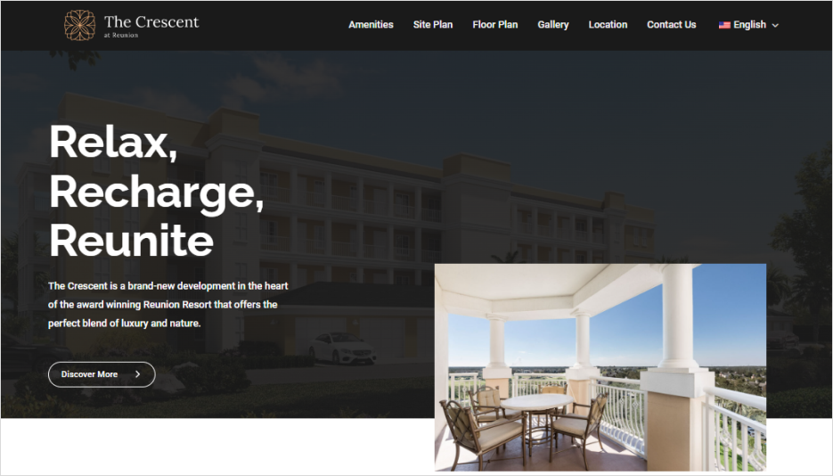
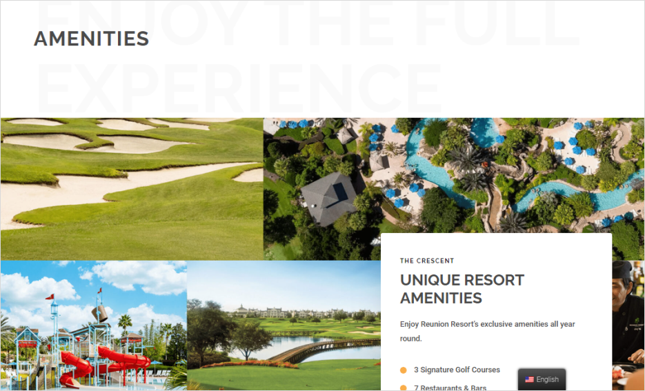
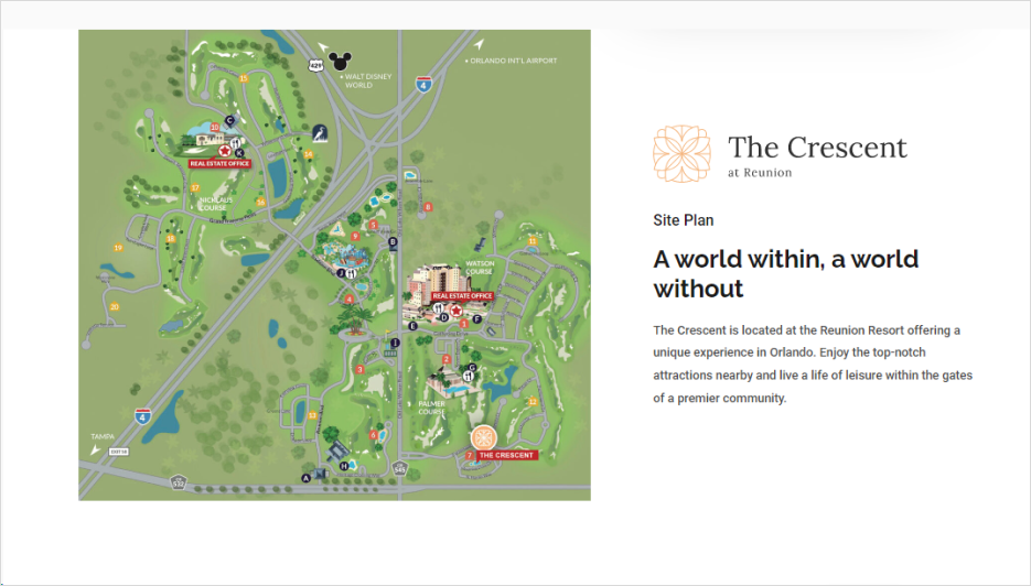
The design of The Crescent’s website focuses on luxury and sophistication. The screenshots highlight a clean and elegant layout with high-quality images that reflect the opulence of the development. Intuitive navigation and strategically placed call-to-action buttons guide visitors through the site, making it easy to explore amenities, floor plans, and location details.
Optimized for Performance and Speed
Because no one likes waiting, we ensured The Crescent’s website loads fast and performs smoothly across all devices. Leveraging image optimization, caching strategies, and clean code practices, the site keeps both Google and impatient users happy. A luxury experience should feel effortless — and that includes how quickly the page loads.
The visual strategy emphasizes a seamless user experience across all devices, ensuring that potential investors have access to information whether they are browsing on a desktop or mobile device. The use of a consistent color scheme, professional typography, and engaging visuals creates a cohesive and immersive experience that aligns with The Crescent’s brand identity.
Technologies:
WordPress


