
Retro design is having a major moment — and honestly, it never really left. From bold color palettes to vintage fonts straight out of an old-school diner sign, nostalgia is taking over graphic design, fashion, and branding. In 2026, the trend isn’t just holding strong. It’s getting louder, stranger, and more intentional than ever.
Why We Keep Coming Back to Retro
Nostalgia is a powerful thing. It makes us feel warm, fuzzy, and oddly safe — like flipping through an old photo album or hearing a song from your childhood. Brands tap into this emotional goldmine to build trust and authenticity. Whether it’s older generations reminiscing or younger crowds discovering the aesthetic for the first time, vintage vibes just hit differently.
There’s also a cultural reaction at play in 2026: as AI-generated content floods every corner of the internet, audiences are gravitating toward things that feel human, handmade, and imperfect. Retro delivers exactly that.
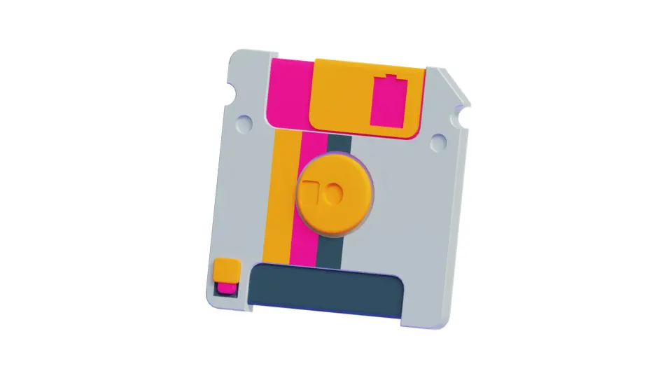
Retro Design Trends That Are Dominating in 2026
1. Loud and Proud Color Schemes
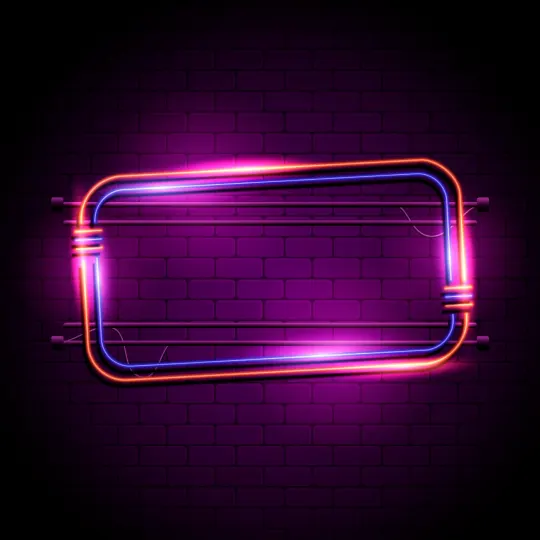
Pastel dreaminess from the ’50s, neon madness of the ’80s, earthy ’70s tones — all still going strong. High-contrast duotones and punchy color combos are everywhere, from startup branding to editorial web design. The key shift in 2026: colors are being used more intentionally, with retro palettes anchoring otherwise minimal layouts.
2. Old-School Typography
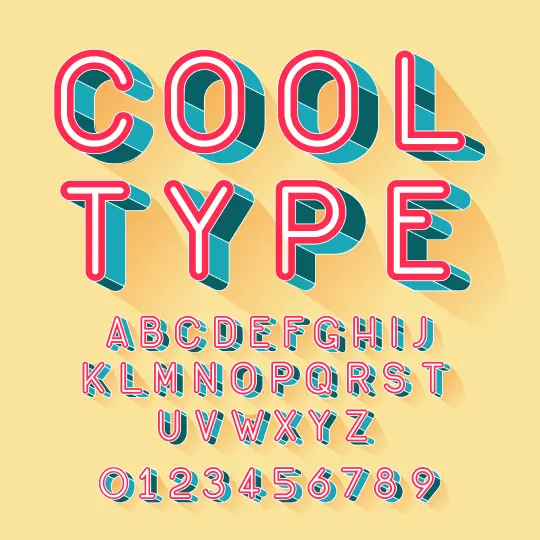
Bold blocky fonts, swoopy scripts, and serif-heavy lettering continue their comeback. Art Deco flourishes, funky ’90s display faces, and condensed grotesks from the ’50s are giving modern designs personality that system fonts simply can’t match. Variable fonts make it easier to work with expressive type across sizes and weights — though you still need the right license for commercial use.
3. Perfectly Imperfect Textures
Grainy filters, halftone effects, risograph-style prints, and distressed overlays give designs that analog, printed-on-paper feel. Even digital-native brands are leaning into rough-around-the-edges charm — a direct counter-response to the polished, AI-assisted look that has become visually exhausting.

4. The Y2K & Pixel Comeback
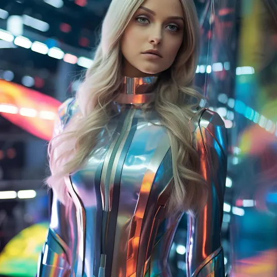
Early 2000s cyber aesthetics, pixel art, and chrome gradients are still evolving. In 2026, Y2K has moved beyond ironic nostalgia into genuine design language — appearing in mainstream packaging, fashion campaigns, and even fintech interfaces trying to shake off the corporate look.
5. Skeuomorphism Is Back (For Real This Time)
Flat design dominated for over a decade. Now depth, texture, and realism are returning. Buttons that look pressable. Dials that look turnable. Leather-textured UI panels, embossed effects, and realistic shadows are showing up in premium apps and product pages. This isn’t the heavy-handed skeuomorphism of the early iPhone era — it’s more refined, used selectively to add tactility and warmth.
6. Hand-Drawn and Craft Aesthetics
In a world where AI can generate any polished visual in seconds, the things that feel unmistakably human stand out. Hand-lettered type, rough illustration, marker-style icons, and intentionally imperfect layouts are trending hard — especially in branding for food, lifestyle, and independent businesses. If it looks like a real person made it, that’s the point.
7. Retro Futurism
The intersection of vintage sci-fi and modern design keeps growing. Think ’70s space-age shapes, analog control panels, and chromatic aberration effects paired with contemporary typography. Music and gaming campaigns have leaned into this look for years, and it still shows up whenever brands want nostalgia with a futuristic edge.
The Designers Who Defined Retro Aesthetics
Several designers shaped the retro vocabulary we keep borrowing from:
- Saul Bass — Iconic movie title sequences and logos (AT&T, Warner Bros.). His bold, minimalist style is still a direct reference for modern brand designers.
- Milton Glaser — Creator of the “I ♥ NY” logo and a pioneer of psychedelic poster design that defined the ’60s and ’70s.
- Paul Rand — Branding genius behind IBM, ABC, and UPS. Proof that clean, timeless design outlasts trends.
- David Carson — ’90s grunge typography icon. His chaotic, rule-breaking layouts revolutionized magazine design and still influence the alternative aesthetic.
- April Greiman — One of the first designers to blend digital tools with retro sensibility in the ’80s, creating a style that felt futuristic and nostalgic at the same time.
How to Nail the Retro Look Without Overdoing It
- Mix old and new. Borrow from the past but keep it functional. A vintage palette on a modern grid works. A full recreation of a 1972 brochure usually doesn’t.
- Go easy on effects. A grain overlay and a halftone accent? Yes. Stacking every retro effect at once? It reads as parody.
- Choose fonts wisely. Vintage charm is great, but legibility is non-negotiable. Test your type at mobile sizes before committing.
- Be inspired, not stuck. Classic elements work best when they’re filtered through a current lens — not frozen in the era they came from.
- Use imperfection deliberately. The hand-drawn trend works because it feels intentional, not sloppy. There’s a difference.
Final Thoughts
Retro design isn’t a fleeting trend — it’s a creative toolkit that keeps evolving because human emotion doesn’t change much. Nostalgia, warmth, authenticity, and the desire for things that feel real will always have a place in design. In 2026, with AI smoothing out everything around us, the rough edges are more valuable than ever.
The right mix of old-school flair and modern craft isn’t just a recipe for visual success. It’s a way to make people stop scrolling.
