


Hey there, it’s Marcos, your friendly neighborhood UX designer. Let’s talk about something that keeps us all up at night: web forms abandonment. Yup, it’s a real pain point, but fear not – I’ve got some simple UX tips to help you turn those abandoned forms into conversion gold!
Forms, folks – they’re the lifeblood of user-product communication. From gathering info to processing payments and everything in between, forms are where the action happens. But here’s the kicker: a whopping 80% of users bail on forms before hitting submit. Ouch, right? It’s all down to bad UX practices, but we can fix that!
Check out these 6 UX tips to keep your forms on point and your users happy:
1. Don’t include irrelevant data fields
Think about the questions you want users to provide and evaluate how important they really are. Ask only for the information you need. Forms should be as short as possible and to the point.
If you want to gather a lot of information in one long form, separate the requests by steps. It helps users feel less overwhelmed.
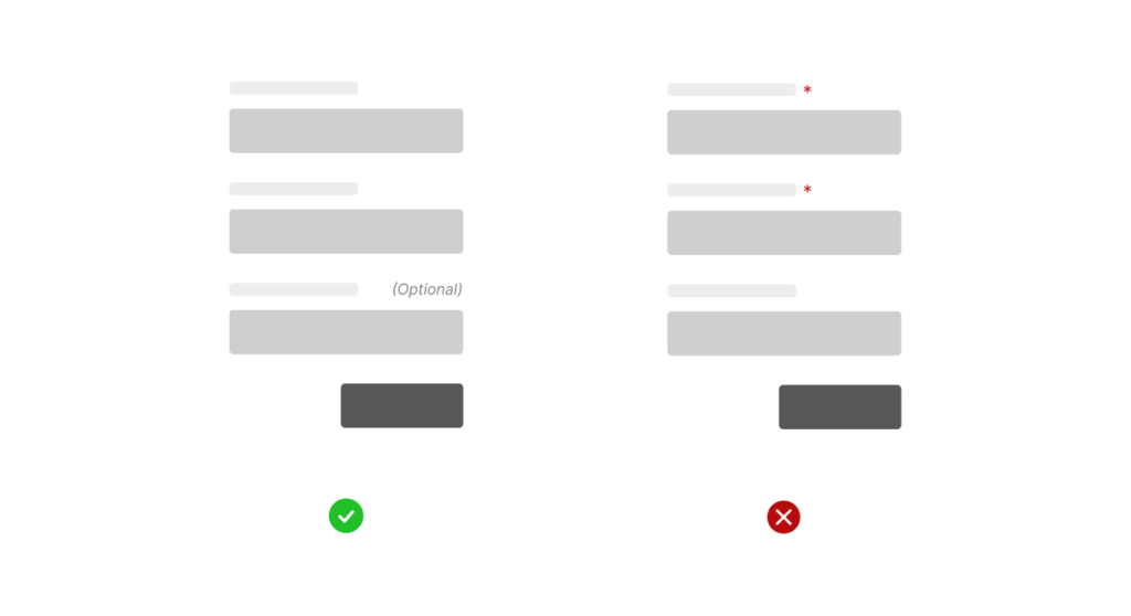
2. Label the optional fields in your web forms
Instead of indicating the mandatory fields, label the optional fields. By highlighting this positive aspect, users feel the choice is theirs.
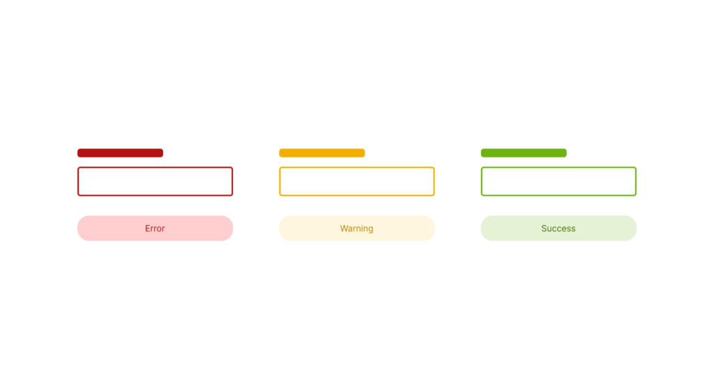
3. Make clear and kind validations
Error and success messages should be clear. The user has to understand if they completed the action properly or if something went wrong.
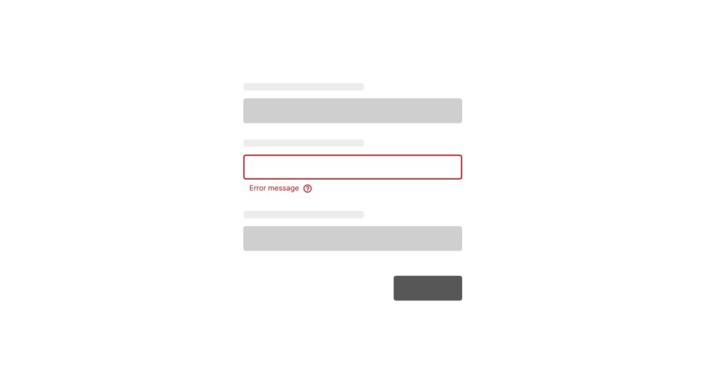
Create positive messages focusing on the solution instead of making the user feel guilty for committing an error.
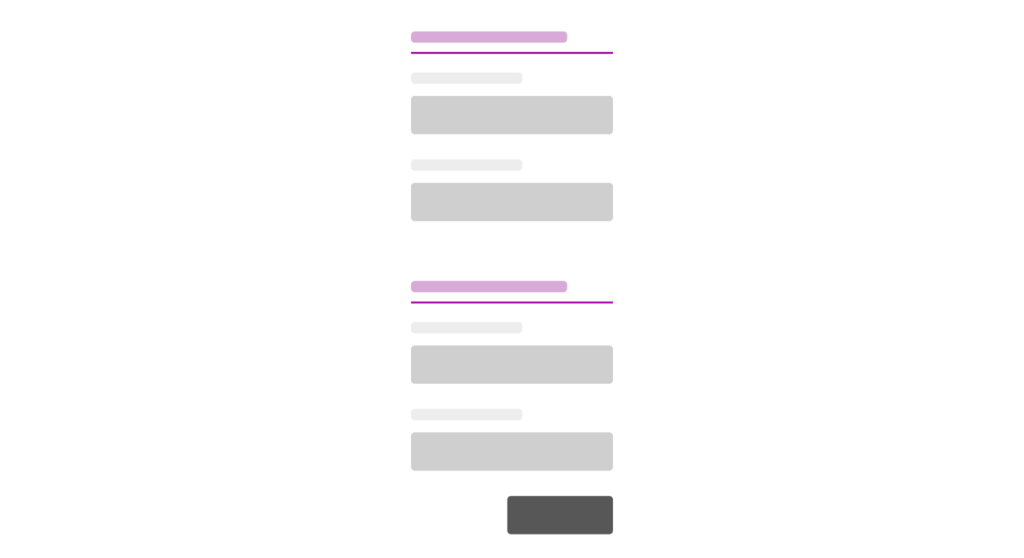
4. Group fields by topic
In long forms, grouping the fields by topic makes the information clearer and easier for the user to understand.
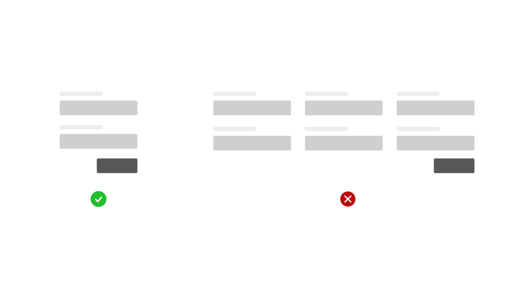
5. Align fields in a single column
It’s better to place the fields in one column with the title at the top, rather than to place them in several columns.
Otherwise, users might get lost or feel confused when filling them out.

6. Web forms also need proper colors
Create form templates that match the brand’s color palette and style. However, remember to leave out actionable colors from the main form scheme.
Use red for errors, orange/yellow for alerts, and green for successful messages.
Stop Losing Users: Make Web Forms People Actually Finish
Web forms aren’t just about collecting info—they’re mini customer journeys. Nail the UX, and you turn a chore into a smooth, satisfying experience that builds trust and boosts conversions. These six tips are a great start, but remember: great UX doesn’t stop at the submit button. Keep optimizing, keep testing, and keep your users at the heart of every interaction.
