UX/UI
Redesigning your website: 5 steps to startDo you need a website refresh? Start now!
August 17, 2021What things can’t be missing on my 404 page?
August 17, 2021
By: Maria
If you’re here, you likely need to develop a 404 error page… but you also want it to stand out!
We experienced this firsthand. During our recent website overhaul, after addressing all the main sections, we recognized the need for an equally impressive 404 page.
When you set out on this task, you probably checked all the lists of original 404 pages on the internet, but you don’t see how to apply them to your site. Right?
Well, let’s start designing it now. Are you ready?
I know it may seem unattainable now, but let’s start from the beginning. A 404 page is a landing page that tells your site viewers the requested page is unavailable or, in some cases, doesn’t exist.
Our task is to find the best way to convey this to users who are seeking information. And the ultimate goal for you: is not to lose those visitors, but to make them stay on your site.
📣 Explain the Problem: Clarity is key. A simple message like “The page you are looking for cannot be found” encapsulates this principle.
💩 Say it straight: Acknowledging that you have a problem is the first step, as they say. You don’t want to hide it, users are not happy to see a 404 page, but you can turn this experience into something positive.
🔎 Make sure that on this page your visitors can find tools to stay on your site. Search bar, menu, contact information, or a link to the homepage work perfectly.
🎩 If you have worked so hard on the design of your site, make sure the 404 is no exception. Maintaining the style is essential at this point, as the user should find it familiar. If they come across a different design, they might close the page without even looking at the content.
💔 Of course, don’t forget to check your broken links.
Now, let me tell you about the decisions we made in the creation of ours.
Definitely, the design had to be aligned, but having this in mind, we worked on the concept, because that’s how we are, we love to think content! 🙂
That’s why it’s important to act fast and give yourself alternatives, something like a floating rope tied around your waist to get you back to your spaceship: a link back home.
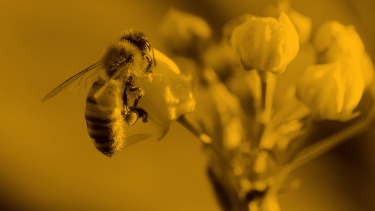
If you haven’t navigated our site yet, I’ll summarize it for you: it’s about space. Yes, a website of a development company about outer space, planets, and all. The structure is designed for those who visit the site to go through each planet, with different sections.
Putting ourselves in the user’s shoes, we decided to continue with the general narrative. So, the story is this: you navigate through space, you go from planet to planet, seeing stars, space stations, and asteroids… And suddenly, a black hole.
A total blackout.
You get lost, and you don’t know which way to go back, and you may even forget where you were going! That’s why it’s important to act fast and give yourself alternatives, something like a floating rope tied around your waist to get you back to your spaceship: a link back home.
And on the other hand, take away the anguish of waiting by offering you a different and pleasant experience. For example, would you like to listen to the Space Hitchhiker audiobook? You would, wouldn’t you? Then go ahead and enjoy it! 👇
In conclusion, don’t limit your 404 page to just technical elements. Infuse it with narrative flair. You’ll find that integrating it seamlessly into your website not only enhances user experience but also encourages visitors to stay longer.
We're the best in the business to help you rebuild or pivot your idea!
Our consulting service will guide you through the difficult path of developing your first product.
We know how to work with small budgets (and we know a lot about bootstrapping!).